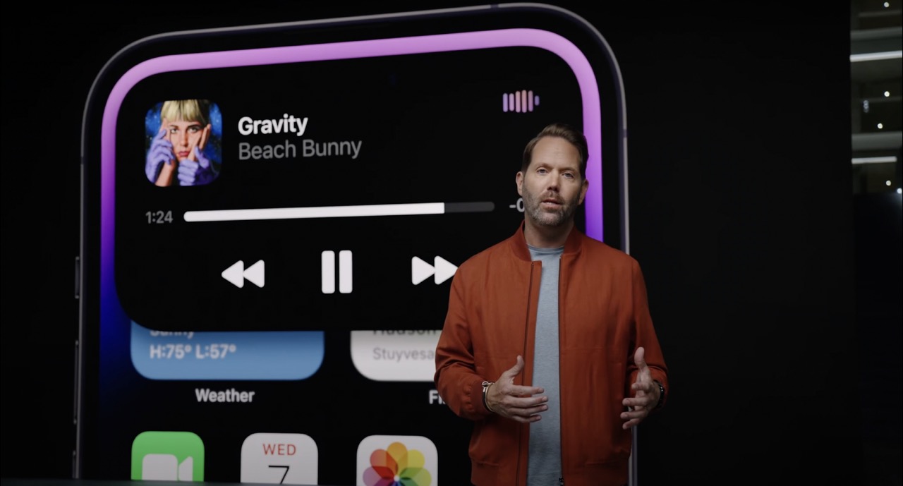
During the interview with the Japanese magazine Axis, Federighi, who oversees the development of iOS, said Dynamic Island represents the first major user experience change for the iPhone since the iPhone X five years ago.
It's probably the first major operation change in five years since the iPhone X came out. Five years ago, we lost the home button with iPhone X. This has fundamentally reviewed various iPhone operation methods, such as how to unlock the lock screen, return to the Home Screen, and how to switch apps. This new feature has also changed the appearance of the iPhone, and it made me think again about how to run multiple apps, notifications, and how to manage the ongoing behavior in the background. It was a very exciting challenge for us to consolidate what is happening on our iPhone into this small interactive place.Dye, who presented Dynamic Island during Apple's "Far Out" event last month, said Dynamic Island further blurs the line between where the hardware ends and the software begins on iPhone, calling it an example of "Apple-like development."
For one purpose, our hardware and software partners will come together in the same studio to solve the problem together. This new feature also made it possible to display alerts, notifications, and ongoing operations in real-time without seeing the boundary between hardware and software. I think it's a good example of Apple-like development.Speaking about where the idea of Dynamic Island originated from, Dye said that the team thought about what the extra space at the top of the display could be used for, thanks to the smaller TrueDepth camera system.
At Apple, it's very difficult to trace the source of ideas. Because our work is based on a huge discussion with different groups of people. However, one of those discussions was that if the sensor area on the screen could be made smaller, what could be done with the surplus space. It's not an argument that has come out in the past year or so, but it's one of the topics that has been discussed for many years.Dye said the status bar area is a small yet crucially important part of the iPhone experience. "It is an area where our hard work put into every pixel has a very big effect," Dye said. "So, there was a story about doing something more special in this area anyway. Something that is very elegant, yet very useful."
So that this experience feels so smooth and natural, we brushed up with meticulous care and skills from both sides of design and engineering. Our goal was to make them forget that there is static physical hardware and make them think that the whole thing is fluid-like dynamic software.Federighi noted that during the iPhone 14 Pro's event at the Steve Jobs Theater at Apple Park, there was an audible sense of surprise when Dynamic Island was revealed for the first time, saying that he had the same reaction when he saw it for the first time internally. "Personally, I felt as if there was a new life-saving identity on my iPhone," Federighi said. "It's a very delicate animation effect, but it's a little different from anthropomorphism, but I think it gave the iPhone a new strong personality and vitality."
Since its introduction, Dynamic Island has received positive reactions from users and customers online, with some calling it one of Apple's best designs in years. Already, some Android makers are looking to replicate the Dynamic Island experience on other smartphones.
Related Roundup: iPhone 14 Pro
Tag: Dynamic Island
Buyer's Guide: iPhone 14 Pro (Buy Now)
Related Forum: iPhone
This article, "Apple Executives Talk About iPhone 14 Pro's Dynamic Island in New Interview" first appeared on MacRumors.com
Discuss this article in our forums
source https://www.macrumors.com/2022/10/02/iphone-14-pro-dynamic-island-interview/


0 Comments