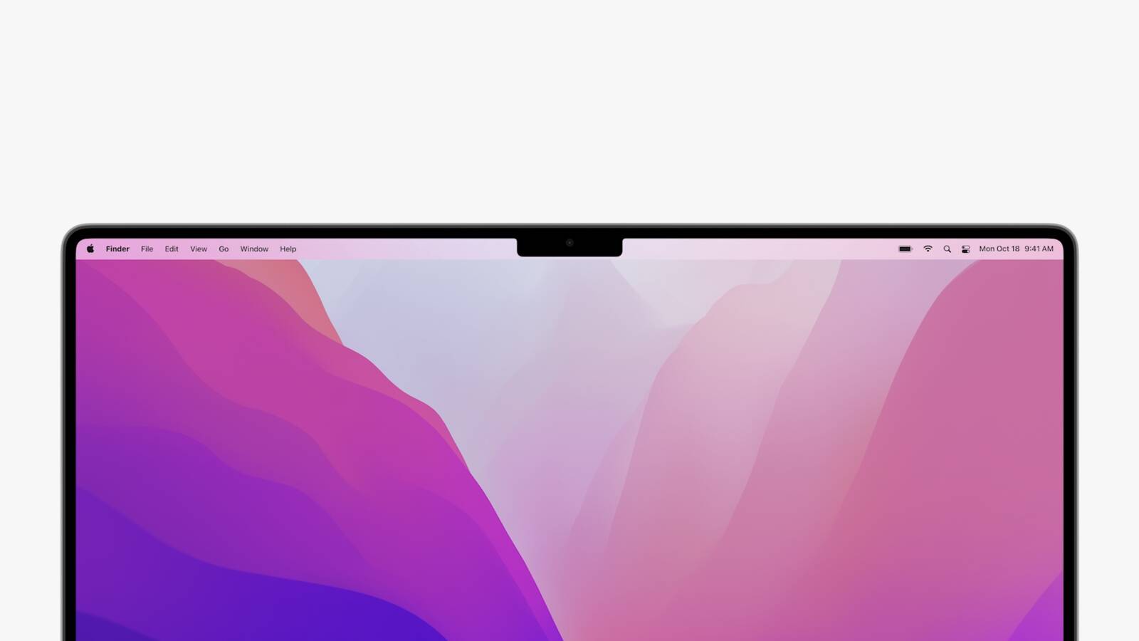
The concern was that extended menus or menu items in the menu bar would be inadvertently hidden behind the notch. Based on new video evidence, that at least appears to be the case for non-updated apps that make extensive use of menu items, but not the case for apps that have extended dropdown menus.
Snazzy Labs YouTuber Quinn Nelson shared two videos on Twitter bemoaning the impact that the notch has on versions of two third-party apps that have not been updated to make way for the notch. In the first video, menu bar items for popular app iStat Menus are shown as being partially concealed behind the notch but still accessible using the mouse pointer.
By contrast, in the second video, when Nelson launches an old version of DaVinci Resolve, he discovers that the video editing app's extended dropdown menus avoid the area of the menu bar concealed by the notch, and that the mouse pointer is blocked from entering the concealed space.
WHO DESIGNED THIS?! 😂 pic.twitter.com/ADVqmfdqV2
— Quinn Nelson (@SnazzyQ) October 26, 2021
The latter behavior appears to be an intentional move by Apple. By disabling the active space under the notch area and blocking off the mouse pointer, this ensures that older apps can't display menus in that space. DaVinci Resolve was in fact updated on Monday to v17.4 and provides full support for the new MacBook Pros, so the mouse pointer should be able to enter the notch area in the app's native fullscreen mode in order to hide it, which is also normal system behavior in Monterey.
In the second video, Nelson goes on to complain that the notch is causing DaVinci's extended menus to take over the menu items of iStat Menus on the right-hand side of the menu bar. However, this is entirely normal behavior in macOS running on any Mac and is unrelated to the presence of the notch.
Apple ensured that developers can choose to have their app's content shown on either side of the notch by making use of a new "compatibility mode" in macOS Monterey that prevents apps from unintentionally putting content in the region the housing occupies. In fullscreen mode compatibility mode automatically accounts for the camera housing by placing a black bar across the top of the screen to hide the notch and prevent app content from being placed there. However, macOS also includes a new property list key that lets developers specify whether their apps should conform to compatibility mode or if their apps can expand to use the space on either side of the notch.
For what it's worth, Bjango, the developer of iStat Menus, doesn't believe that adding compatibility support to its app would change the behavior of the status items when other apps are in the foreground, and isn't likely solve the issue presented in the video. If that turns out to be true, this could be one unintentional quirk of the notch that Apple needs to address for apps that make extensive use of right-side menu items.
Related Roundups: 14 & 16" MacBook Pro, macOS Monterey
Buyer's Guide: 14" & 16" MacBook Pro (Buy Now)
Related Forums: MacBook Pro, macOS Monterey
This article, "Video Highlights Menu Bar Behavior in Apps Not Updated to Accommodate MacBook Pro Notch" first appeared on MacRumors.com
Discuss this article in our forums
source https://www.macrumors.com/2021/10/27/macbook-pro-notch-menu-bar-behavior/


0 Comments